Posters are a hugely important part of scientific congresses. The submitted abstracts that get accepted as oral presentations are always only a fraction of the science available at conferences. And which abstracts get selected as oral presentations are, to a degree, at the whim of the abstract assessment committee and procedures. So, there will be some gems amongst the posters that have the potential to change practice.
I gave a talk at IPS today: a practical guide to assessing scientific posters. You can download my slides here. But they will only tell part of the story. The idea was for the session to be a practical workshop to arm those who are new to infection prevention and control with the tools to maximize their conference experience in terms of accessing submitted science.
I covered the publication process: concept -> research -> abstract -> poster -> paper -> “post-publication peer review”. It was interesting to think in more detail about what makes a good poster. Clearly, first and foremost, a poster must be visual. If it doesn’t look good visually, then it’s not a good poster. That said, what looks “good” is somewhat subjective, but I think some basic themes emerge in terms of visual presentation:
- Eye catching – draws the viewer in
- Graphical, not text based
- Not cluttered
- Good use of colour
- Clear ‘flow’ from one section to the next
- Key findings communicated clearly
- Contains more detailed information for those that want it
- Correct size for the board (check the guidelines!)
- Not an essay / epic; it’s designed to stimulate discussion
- No intricate fonts that are difficult to read
- Watch out for fuzzy low-res graphics
- You can’t include all your data – be selective
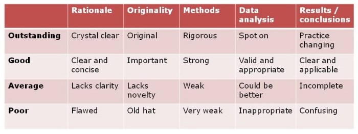
And then there’s the scientific content. Really, this is the same question as what makes a good abstract or, indeed paper. The following criteria may be useful in this regard:
Table: what makes a good poster (or abstract, or paper) in terms of content?
So, I hope the participants found this session useful.